Ticco Foods
Inspired by1950/60’s Italian Graphic Posters in Milan where Ticco’s product of Italian desserts & gelato originated, I have enabled a modern Italian brand feel that compliments Ticco’s diverse customer reach.
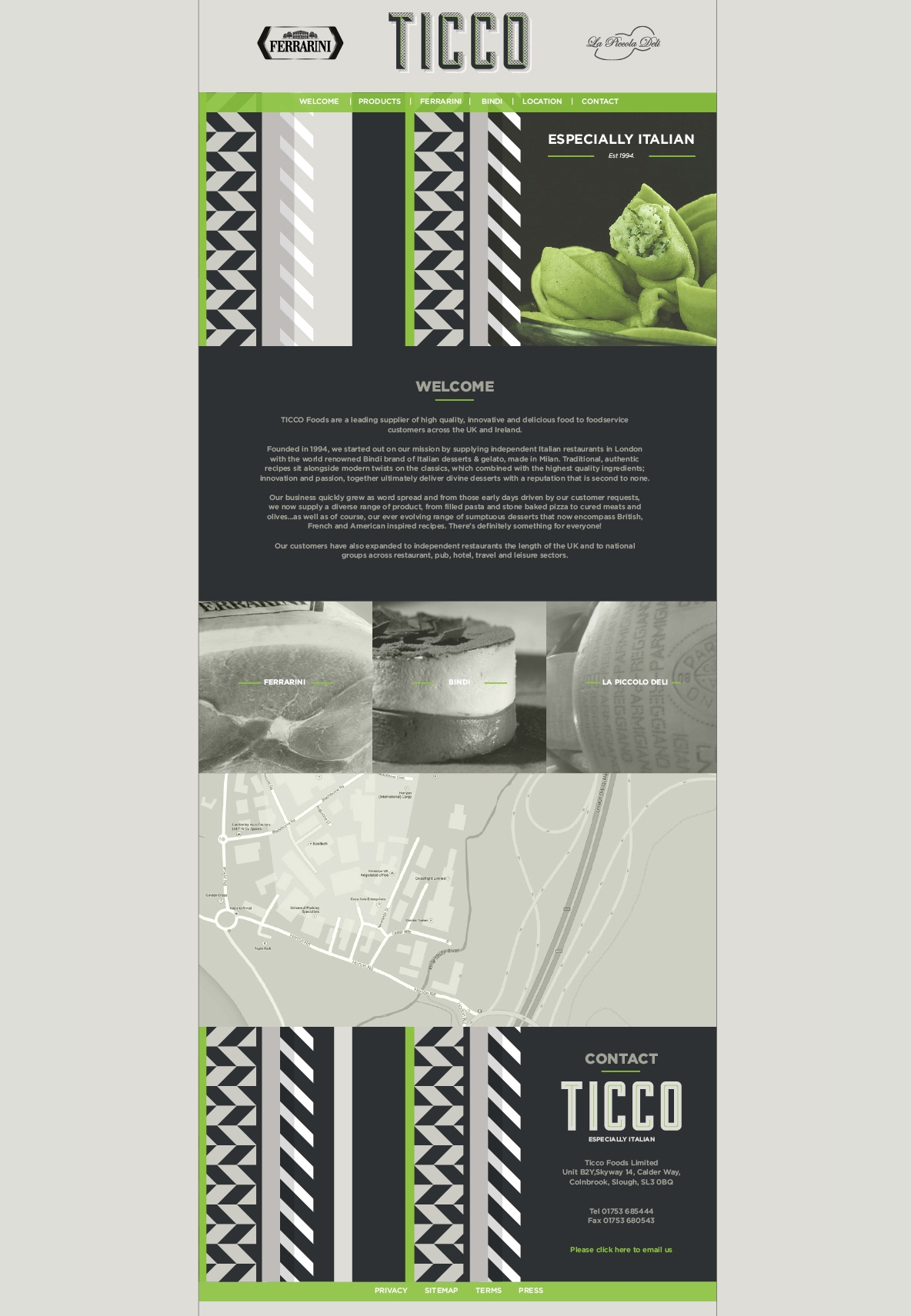
Combing this with abstract graphic shapes of easily recognised italian food in a pattern formation (pasta, decorative icing, marbled cured meats) and using a more muted colour palette with minimal use of the accent green colour, produces a simplistic yet sophisticated sense of Italy.
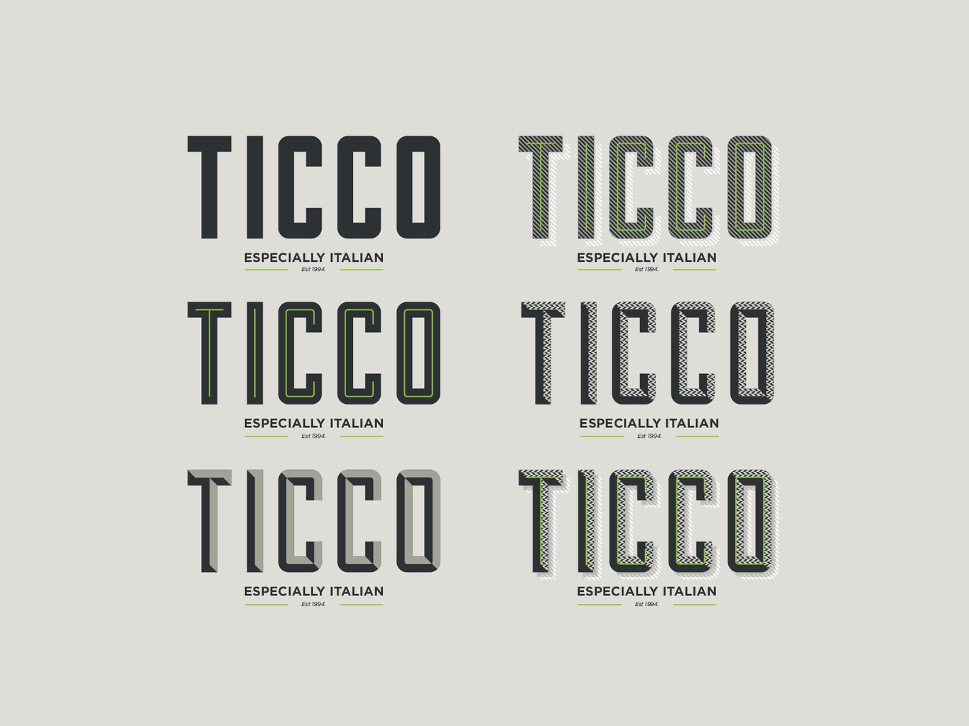
The layered effect logo allows for variation between applications or facets of the Ticco Brand. Styles can be combined or used in their most simplistic form to fit in with different requirements and to allow unique charm across all areas, thus creating a really ‘dynamic identity’.
This playful approach allows the branding to be premium without being too serious. Each iteration is different enough to provide intrigue, whilst consistently always being Ticco
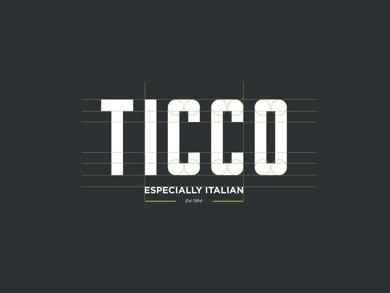
Hand crafted lettering combined with a chosen typeface creates a contemporary feel and allows the brand to feel both artisan and established.


